
Share


Big Computing
Web professionals tend to use large monitors and assume everyone else using a desktop computer also has a big monitor. So a typical screen resolution report in GA, filtered for desktop, would look like: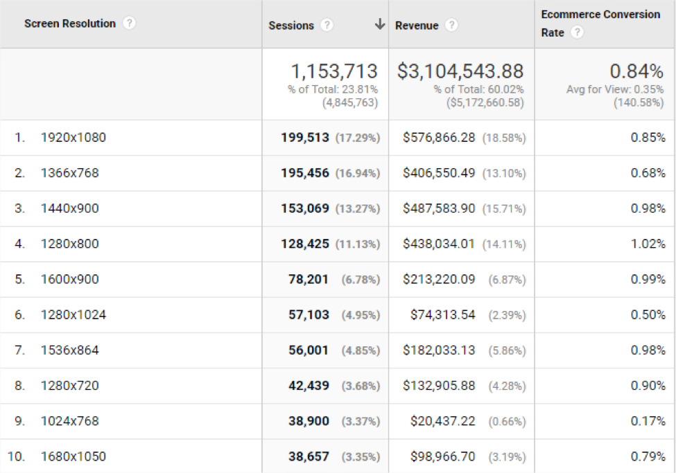 One look at this and the website manager would easily jump to a few conclusions:
- 1920 x 1080 drives the most sales and so should have the most optimization and testing.
- Widescreen drive more sales than non-widescreen (square), so design considerations for non-widescreen displays can be ignored or minimized.
- High resolution displays don’t even crack the top 10 list, and so special treatment for what could be a high spending segment (high resolution and high DPI displays) aren’t necessary.
Where did we go wrong?
There is a mistake in this analysis and you can see it if you walk around any office and look at everyone’s monitors: not everyone uses their browser as a maximized window! Also, the analysis doesn’t account for high DPI displays which are becoming more common and can emulate a number of screen resolutions. There are four typical browser layouts you’ll find on desktop computers:- Browser is full screen.
- Browser window is in a square shape.
- Browser window is quite tall but not so wide—portrait like a cell phone.
- Browser window is quite wide but not so tall—landscape like a tablet.
Details, Details, Details!
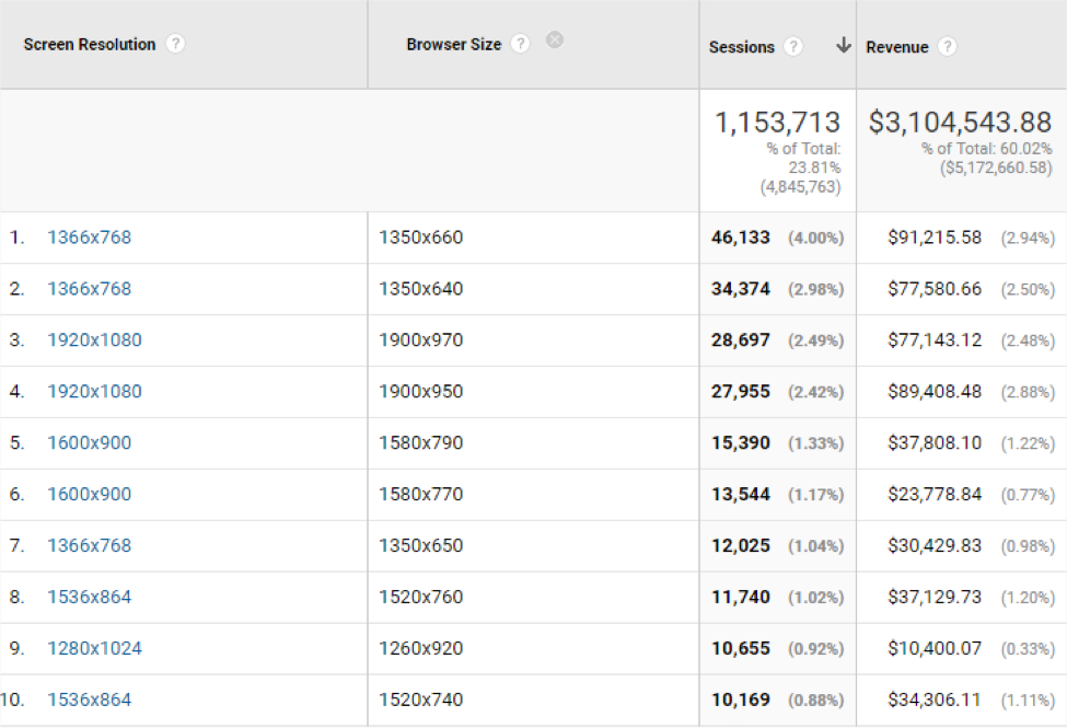
The actual size of the browser window is known as the viewport and is a little known dimension in Google Analytics: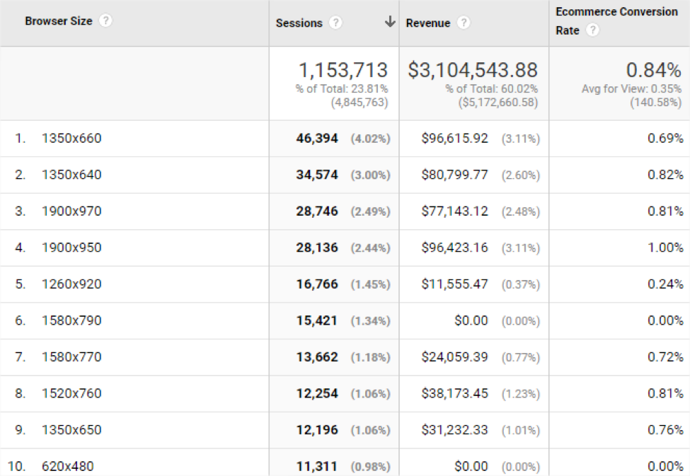 Immediately you notice a few entries with quite a few sessions, but no or low sales. These are leads to follow and explore.
When Browser Size is added as a secondary dimension to the first report, the resulting pairs of screen resolution and viewport make the original report look quite different. No longer does 1920 x 1080 dominate the report!
Immediately you notice a few entries with quite a few sessions, but no or low sales. These are leads to follow and explore.
When Browser Size is added as a secondary dimension to the first report, the resulting pairs of screen resolution and viewport make the original report look quite different. No longer does 1920 x 1080 dominate the report!
 Using a few custom dimensions to collect additional data points such as Browser Layout and
device pixel ratio
, the technology used by your customers will be more readily available in custom reports. An analysis in Excel will highlight the difference between average and common screen resolutions:
Using a few custom dimensions to collect additional data points such as Browser Layout and
device pixel ratio
, the technology used by your customers will be more readily available in custom reports. An analysis in Excel will highlight the difference between average and common screen resolutions:
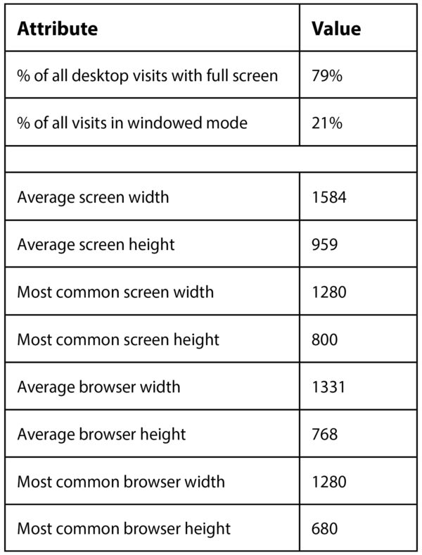 Not as simple as reporting 1920 x 1080 is the top screen resolution! The long tail of many browser viewports and different taskbar/dock heights results in less glamorous numbers.
Where do we go from here?
Better labelling of browser configurations in your core data layer will give you on demand the kind of reports you need and without going into Excel. For example, you can create a session-scoped custom dimension called Browser Layout with a value of four general shapes a browser can take: full screen, square, portrait, and landscape. This is easiest to do when a page is loading and made part of the core data layer. The end result could look like this:window.dataLayer = window.dataLayer || []; window.dataLayer.push({ 'event': 'dataLayer-initialized', 'browserLayout': 'portrait', 'devicePixelRatio': window.devicePixelRatio, // other core data layer values });Accurate and consistent calculation of the browser shape is a challenge but good designers and JavaScript developers will be able to help. A previous post on this blog, How to Track Responsive Websites , offers some code that may be reused as well as introduce you to the related concept of responsive design breakpoints. There are a few tools that can be used to understand screen and viewport size in Javascript:
- Dimensions tool by Ryan Van Etten
- Mydevice.io
- mqtest.io
Better Insights
Knowing a few extra pieces of data, you can look for high performing combinations as well as combinations that might be suffering poor content layout or other visual bugs. Below is a custom report based on the custom dimension of Browser Layout: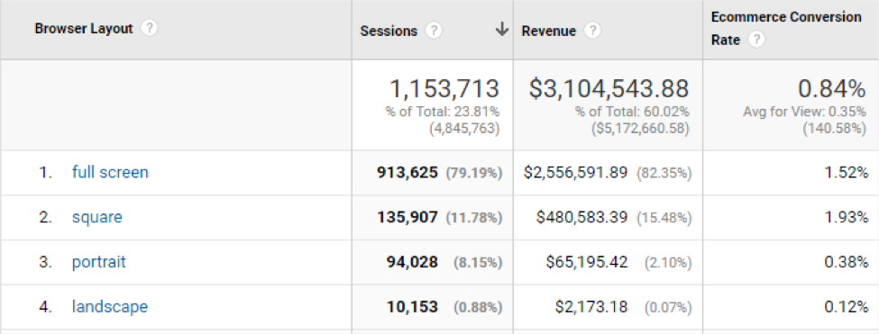 Knowing the truth is an opportunity to better understand the visitor and make incremental and measurable optimizations. Custom dimensions and metrics are your friend—brainstorm, implement, and learn.