Google announced the BigQuery ML service at Google Cloud NEXT 2018 in San Francisco. They have published wonderful help articles and guides written to go along with the product release that you should read here.
What is BigQuery ML?
Hint: It makes machine learning accessible to all (SQL practitioners)! Google touts their new product as having democratized machine learning by giving data analysts, and folks familiar with SQL, the ability to train and evaluate predictive models without the need for Python or R data processing. As an example of how impactful that goal is at Analytics Pros, our team is mostly comprised of Data Analysts with a much smaller subset of folks who have "Machine Learning Engineering" in their job title. Our ratio of data practitioners to data scientists is large enough to call this a "game changer" for our organization. Using BigQuery ML, you can easily create predictive models using supervised machine learning methods. The predictive modeling tools at our disposal are Linear Regression (predicting the value of something) and Binary Logistic Regression (predicting the type/class of something). We're able to write a query that includes a "label" that will train our model using any number of data features. Data features are numerical or categorical columns that are available to make a prediction when a label is absent. The label in our training data is what makes this supervised machine learning (opposed to unsupervised learning in which we don't have access to labeled data).
Build a predictive model using SQL and BigQuery
Our goal in this article is to predict the number of trips NYC taxi drivers will need to make in order to meet demand. This is a demand forecasting problem, not unlike problems you might encounter in your respective business vertical. Using a classic example written by the Googler, Valliappa Lakshmanan , we’ll convert his Python+TensorFlow machine learning demonstration into the new BigQuery ML syntax. Be sure to follow along using the Google Colaboratory published on Github. Our input data (features) will consist of weather data in the NYC area over the course of three years. Those data features will be trained to predict a target variable coming from the NYC Taxi dataset. The target variable is the number of taxi trips that occurred over the same three year period as our weather data. Our data features combined with the target variable give us everything we need in order to train a machine learning model to make predictions about the future based on observations from the past. The combined dataset of weather + taxi trips gives us labeled data, including features (weather data) and a target variable, ie. label (taxi trips). Using BigQuery ML, we will train a linear regression model with all of the heavy lifting done for us automatically, saving time without losing any predictive power. Some of the auto-magical work done for us includes splitting training and testing data, feature normalization and standardization, categorical feature encoding, and finally the very time consuming process of hyper-parameter tuning. Having this type of automation saves us a non-trivial amount of time, even for experienced ML engineers! BigQuery ML gives data analysts that are skilled with SQL, but less familiar with Python ML frameworks like TensorFlow or SK Learn, the ability to generate predictive models that can be used in production applications or to aid advanced data analysis. We encourage anyone wanting to use the BigQuery ML service to familiarize yourself with the underlying concepts of machine learning, but it is important to note that the days of having a PhD as a prerequisite for machine learning are coming to an end. This service is helping to bridge the skills divide and help to democratize machine learning data processing. In this article, using the new BigQuery ML syntax, we will:
- Create a linear regression model using SQL code syntax
- Train and evaluate the model using data in BigQuery public dataset
- Inspect the predictive model weights and training metrics
- Make predictions by feeding new data into the model
Count Taxi Trips per Day
First we collect the number of taxi trips by day in NYC. We do this by querying the BigQuery public data for New York City. This SQL will give us the data we need to label our prediction model.
WITH trips AS (
   SELECT
      EXTRACT (YEAR FROM pickup_datetime) AS year,
      EXTRACT (DAYOFYEAR FROM pickup_datetime) AS daynumber
   FROM `bigquery-public-data.new_york.tlc_yellow_trips_*`
   WHERE _table_suffix BETWEEN '2014' AND '2016'
)
SELECT year, daynumber, COUNT(1) AS numtrips FROM trips
GROUP BY year, daynumber ORDER BY year, daynumber
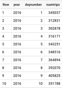 Fig. 1 - NYC Taxi Trips[/caption]
Taking a look at the NYC Taxi Trips Data
Within the trips WITH-clause, we use EXTRACT to generate a date key using the date parts YEAR and DAYOFYEAR. Our example uses the years 2014 through 2016 because the schema is consistent for those periods. The query will COUNT() the numtrips per each year and daynumber in the data. In Fig. 1 we see the number of NYC taxi trips on January 1st, 2016 was 345,037. That was a Friday, and a predictably cold week in New York City. If you look at the data, you’ll see the weekly pattern reveal itself. With peak demand on Fridays and Saturdays with a sharp decline on Sunday and Monday. Learning how to export your BigQuery data directly to Data Studio to explore your data deserves a blog article entirely (stay tuned!) In the meantime I will walk through some of the exploratory analysis steps performed in the Python Colaboratory Notebook supporting this article.
Exploratory Data Analysis
We have a hunch that there is correlation between the number of taxi trips in New York City and the weather. We feel so strongly about this that we're willing to build a machine learning model to mechanize this insight. Before we do this, we want to look at the data and get a feel for whether or not it will be useful in building a linear regression model. For linear regression models to work properly we generally need values with some degree of correlation, but not too tight so as to throw off the model accuracy. A simple way to check for correlation would be to visualize a plot of two metrics against each other. In our case we examine The maxtemp field on the X-axis and numtrips on the Y-axis as Fig. 2: [caption id="attachment_33403" align="aligncenter" width="500"] 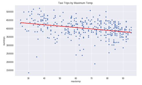 Fig. 2 - Looking at all the data we see a slight correlation between trips and temperature. The line isn't flat, so we're saying there is a chance! The expectation was that temperature would have some influence on the prediction model. In this case, we see as the temperature increases the number of taxi trips decrease. More importantly, the inverse is true: as the temperature decreases the demand for taxi's go up. That is our first insight. However, the insight isn't as valuable as we'd expect. The loss rate on the above line is very high. We want to see if we can find a way to minimize the loss. We already recognized a weekly seasonal pattern in the data when we looked at the number of trips in the first 10 days of January. If a seasonal pattern exists then our linear regression model would improve by factoring it in. Adding
 dayofweek as a categorical variable will improve the model accuracy because the loss rate will have been minimized compared to a linear average on all entities. Below we see the weekly seasonal pattern when we plot dayofweek against numtrips as Fig. 3: [caption id="attachment_33402" align="aligncenter" width="500"] 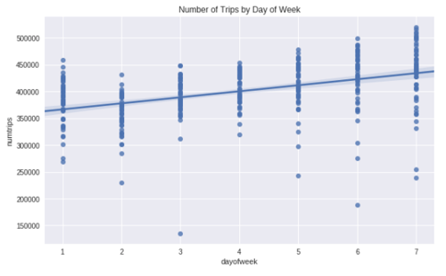 Fig. 3 - We see a pattern in the weekly seasonal data; Saturday a peak with Monday a low.[/caption] Our intuition is validated, by isolating the data by
 dayofweek we are able to increase the correlation rating between the variables. In this case, as we input a higher temperature the prediction decreases. It is slight, but it is an improvement. That improvement, and others are used to optimize the results of the model output, increasing accuracy (by reducing the loss rate). Fig. 4 shows the NYC taxi demand with maxtemp on the X-axis and numtrips on the Y-axis. The correlation increases when we partition the data by dayofweek, in this example we isolate Sunday trips: [caption id="attachment_33404" align="aligncenter" width="500"] 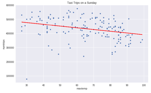 Fig. 4 - As the temperature decreases the demand for NYC taxis goes up[/caption]
Creating a Linear Regression Model using BQML
Now the fun part! We’re going to create a linear regression model using the new BigQuery ML SQL syntax. This new syntax gives us an API that can build and configure a model and then evaluate that model and even make predictions using new data. This model is available on the globally distributed Big Data Machine that is BigQuery. I’m envisioning very interesting applications built on this service, but most importantly I’m seeing a huge breakthrough for data analysts who are skilled in SQL but less so with Python or R. This is a wonderfully democratizing step toward putting machine learning data processing into a much broader reach.
First we need labeled data:
-- Taxi Demand, aka [QUERY]

-- Weather Data
WITH wd AS (
   SELECT
      cast(year as STRING) as year,
      EXTRACT (DAYOFYEAR FROM CAST(CONCAT(year,'-',mo,'-',da) AS TIMESTAMP)) AS daynumber,
      MIN(EXTRACT (DAYOFWEEK FROM CAST(CONCAT(year,'-',mo,'-',da) AS TIMESTAMP))) dayofweek,
      MIN(min) mintemp, MAX(max) maxtemp, MAX(IF(prcp=99.99,0,prcp)) rain
   FROM `bigquery-public-data.noaa_gsod.gsod*`
   WHERE stn='725030' AND _TABLE_SUFFIX between '2014' and '2016'
   GROUP BY 1,2
),

-- Taxi Data
td AS (
   WITH trips AS (
      SELECT
         EXTRACT (YEAR from pickup_datetime) AS year,
         EXTRACT (DAYOFYEAR from pickup_datetime) AS daynumber
      FROM `bigquery-public-data.new_york.tlc_yellow_trips_*`
      WHERE _TABLE_SUFFIX BETWEEN '2014' AND '2016'
   )
   SELECT CAST(year AS STRING) AS year, daynumber, COUNT(1) AS numtrips FROM trips
   GROUP BY year, daynumber
)

-- Join Taxi and Weather Data
SELECT
   CAST(wd.dayofweek AS STRING) AS dayofweek,
   wd.mintemp,
   wd.maxtemp,
   wd.rain,
   td.numtrips / MAX(td.numtrips) OVER () AS label
FROM wd, td
WHERE wd.year = td.year AND wd.daynumber = td.daynumber
GROUP BY dayofweek, mintemp, maxtemp, rain, numtrips
You’ll see magic numbers like 99.99 and 725030 in the above SQL. The stn value is the station id for LaGuardia and 99.99 was found in EDA to be invalid input. Here are a handful of results from the above query, each row represents a day in the 3 year dataset:
| dayofweek |
mintemp |
maxtemp |
rain |
label |
| 4 |
37 |
46 |
0 |
0.565787687 |
| 6 |
66 |
81 |
0.52 |
0.716719754 |
| 2 |
55 |
82.9 |
0 |
0.549772858 |
| 7 |
63 |
79 |
0 |
0.729906184 |
| 4 |
39 |
45 |
0 |
0.652754425 |
Creating a model
Now that we have labeled data it is time to train a machine learning model. BQML has a simple, and familiar, syntax to do this.
CREATE MODEL yourdataset.your_model_name
OPTIONS (model_type='linear_reg') as [QUERY]
It is that simple. You'd replace [QUERY] with the SQL query we used to generate our label data. After only a few short moments we have a regression model generated having been trained and evaluated using three years of taxi and weather data.
Calculating a baseline score for evaluation
[caption id="attachment_33405" align="alignright" width="400"] 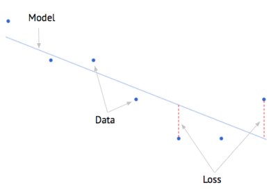 Fig. 5 - Demonstrating a model, data (entities) and the loss[/caption] We are already familiar with an effective linear model. It’s called the “average”. We could very easily spend time building a machine learning model that could be beat by simply predicting the average of the data. In order to prove that our machine learning model is better than the classic linear model (average) then we’re going to need a score metric. Enter the MAE, or otherwise referred to as the Mean-Absolute-Error. The MAE is a way to calculate the aggregate loss rate, and doing so in a way that penalizes big misses. When you think of aggregating the loss rate, then you’re summing all of the loss distances shown in Fig. 5 above. Using Python, we would calculate the MAE using the Google Cloud Python BigQuery API as follows:
from google.cloud import bigquery
client = bigquery.Client(project=[BQ PROJECT ID])
df = client.query([QUERY]).to_dataframe()
print 'Average trips={0} with a MAE of {1}'.format(
   int(df.label.mean()),
   int(df.label.mad()) # Mean Absolute Error = Mean Absolute Deviation
)
Output: Average trips=403642 with a MAE of 50419
The Moment of Truth: Evaluating your Model
There comes a time in every data scientists life in which your going to have to evaluate your model. We do this by setting aside a set of data, in which we know the labels, but will act like we don’t and make a prediction using our new model. We’ll score ourselves based on how good we were at guessing the correct values. BigQuery ML handles this step automatically and provides a simple function to evaluate our model and get back error and loss metrics. Remember, our number to beat is a MAE of 50,419:
SELECT * FROM ML.EVALUATE(MODEL yourdataset.your_model_name, ([QUERY]))
| metric |
value |
| mean_absolute_error |
43800 |
| mean_squared_error |
0.009846 |
| mean_squared_log_error |
0.003598 |
| median_absolute_error |
0.064709 |
| r2_score |
0.200022 |
| explained_variance |
0.20064 |
Our Mean Absolute Error is 43,800. The good news is we were able to beat the baseline error rate of 50,419 found in the previous step. By beating the MAE of the entire dataset, we're able to say that our model has more predictive power than a standard linear average. This is mostly because our model will factor in the day of the week, which we found to be an important signal in the data. In the accompanying Colaboratory Notebook we inspect the weights of the different input features in more detail. Note regarding ML.EVALUATE(): BigQuery ML prints out different score metrics when using a linear or logistic regression model, including Precision, Recall, and F1 Score. You can access the scores of the many training runs using ML.TRAINING_INFO():
SELECT * FROM ML.TRAINING_INFO(MODEL yourdataset.your_model_name)
 [caption id="attachment_33407" align="aligncenter" width="600"]
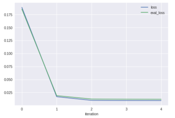
 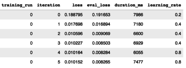 Fig. 6 - Print and visualize the metrics collected during the regression model training[/caption] We see that our model only took a few iterations in order to achieve a low loss rate. In fact, 90% of the loss was diminished between the first and second run. In this case our model didn't have to work very hard to reach a convergence. BigQuery ML, by default, will attempt 20 different training + evaluation iterations before stopping. You can set this number to be higher in the
 OPTIONS when creating your model using the max_iterations flag. Additionally, by default, the training will stop once it sees no progress is being made; this can be overridden using the boolean, early_stop flag. Finally, you'll notice that the learning_rate was fluctuating between training runs, this is an example of hyper parameter tuning that is automatically being performed by BigQuery ML. This is a special, time-saving gift to the data science practitioner, like manna from heaven.
Making Predictions Against the Model
We're now ready to make predictions against our model! To do this, we need to feed it new data. The ML.PREDICT() function will return a prediction for every row of input in the query. The ML.PREDICT() function accepts a MODEL to evaluate against and the input comes from the TABLE or QUERY. Your query needs to be wrapped with a () if that is the route you chose. In the example below we use a QUERY that includes only a single row of input. In other cases you would want to feed in multiple values at once or point the entire input function to a TABLE.
SELECT *
FROM ML.PREDICT(
   MODEL yourdataset.your_model_name, (
      SELECT
         '4' AS dayofweek,
         60  AS mintemp,
         80  AS maxtemp,
         .98   AS rain
   )
)
Using Google's Colaboratory, you can map sliders to the input variables. Each adjustment to the sliders will result in a new prediction being generated by the model. Click this link to fork your own Colaboratory, you will be able to build a model and then make predictions against it in no time at all! (shown in Fig. 7) [caption id="attachment_33408" align="aligncenter" width="600"] 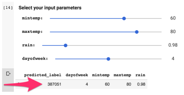 Fig. 7 - Adjust sliders to make new prediction[/caption]
Inspired by the Google Cloud Training on Coursera:
Google has published their notebook on Github, using the TensorFlow approach: Demand forecasting with BigQuery and TensorFlow Be sure to checkout out the entire Data Analysis and Machine Learning course on Coursera to learn about these concepts in detail! Let us know what you think of the new BQML API by tweeting us @AnalyticsPros